
What's on the Dashboard?
The Dashboard you land on after logging in summarizes your whole application process on one screen. The one-line summary under the heading gives you the three numbers that matter most, and the "New Application" button in the top right lets you add a new application directly.
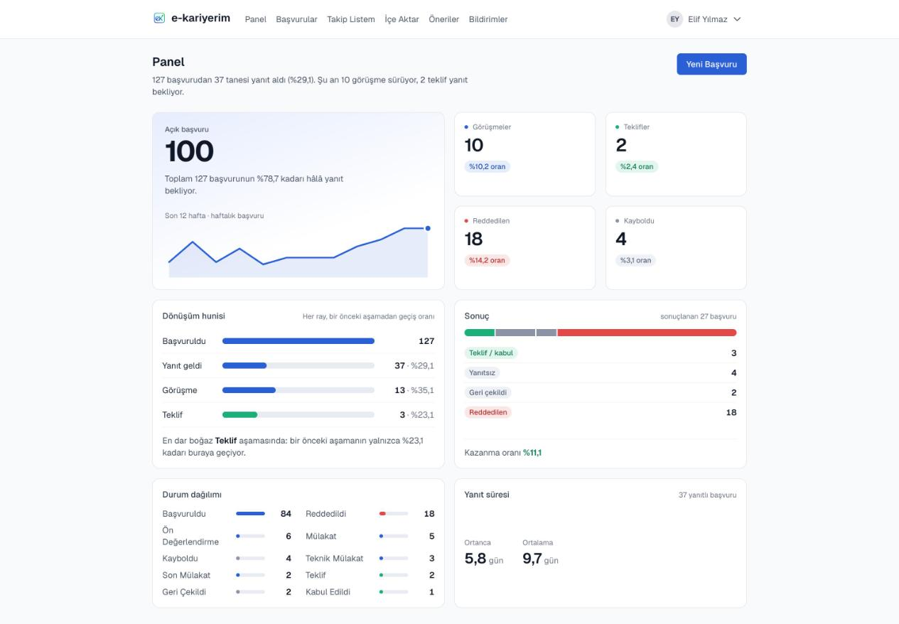
Open applications and the weekly trend
The largest figure on the page is the total still waiting for a reply. The small chart beneath it shows how many applications you sent per week over the last 12 weeks. The four tiles beside it give your interview, offer, rejection and ghosting counts, each with its share of the total.
Conversion funnel
Shows how much of each stage made it to the next one along applied → replied → interview → offer. When the raw numbers are far apart (thousands of applications, a handful of interviews), every rail is still drawn at its own full width, so the small stages stay readable. The line underneath names the stage with the steepest drop-off. Once you have 10 or more applications, the "Share your flow" button on this card builds a card showing where your applications went: download it at the right size for LinkedIn, X, Facebook, Instagram or WhatsApp, or share its link. The card holds only numbers and the period — no company names or roles.
Response time
The median and average number of days from applying to first response, together with how many replied applications they were computed from. If the average sits well above the median, a note says so — a few very late replies pull it up. If nothing has been answered yet, an empty state is shown instead.
Status breakdown
Horizontal bars showing which status your applications are in. If one status is crowded enough to flatten the rest (usually "Applied" after a bulk import), it is drawn full-width on its own scale, and the remaining records are listed below it on a scale of their own.
Outcome
A breakdown of applications that have finished: offer/accepted, no answer, withdrawn and rejected. The band at the top shows their proportions and the line at the bottom gives your share of positive outcomes. Applications still in flight are left out of this.
Snoozing a reminder
Every row of the Follow-up card has "Snooze": follow-up and silence reminders move 3 days, a week or two weeks ahead, the interview question to tomorrow or three days later. A snoozed reminder stays open and comes back on the day you picked; if you snoozed it by mistake, "Undo" at the top of the card brings it back at once. For a longer break from every reminder, use the break below.
Taking a break
The "Take a break" card on your profile gives you a week, two weeks or a month off. During the break the reminders card and the stale-applications question stay off the dashboard; your data stays where it is and the daily scan keeps running underneath. When you come back, one question greets you rather than a pile: whether to close, in one go, the applications that went quiet while you were away. Closing them is reversible; "Not now" brings the card back as it was. You can end the break from your profile at any time.